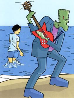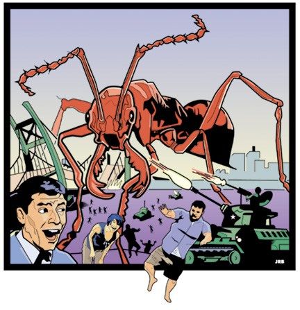
I did this as a t-shirt design for a band whose music I really liked and whose bassist I liked even more! Aww... I had a li'l crushy-crush. They specifically requested a giant ant destroying buildings, so I gave them this. I drew the ant based on a Drew Struzan poster, I think. My friend Frank is breaking the picture plane illegally. You see, he's in the middle-ground and so shouldn't be able to overlap the frame as if he were ahead of Jerry Lewis there in the lefthand corner, but I did that deliberately as a visual joke.
The girl bent over laughing at the hilarity of it all is Hirosue Ryoko, a Japanese actress/singer/model I
also had a crush on at the time.
Despite not having the desired effect (of course the bassist didn't fall madly in love with me), there's a nice coda to this image. I sent it via email to
Hate artist Peter Bagge and he sent me back a nice compliment. Which is probably more than I deserved, but it definitely made my day.
Peter Bagge is awesome.
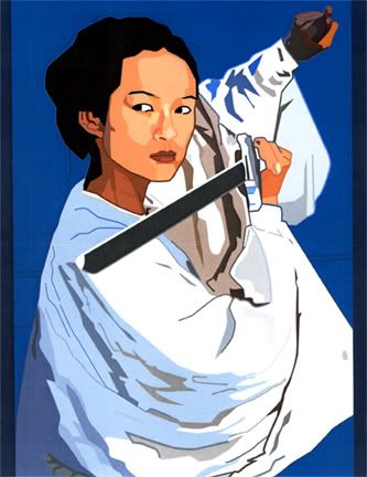
Oh yeah, I later did another shirt for this band, this time featuring a charging rhino crushing their name. That one sold like hotcakes, so I'm told. Do hotcakes really sell that well? Are people so into hotcakes that we had to create a simile to convey the wonders of hotcake consumption? I wish I had an image of that shirt, though. It was great.
Note... I just realized this is the second time I've published this in this blog. Blast! Well, it's good enough to show again I suppose.
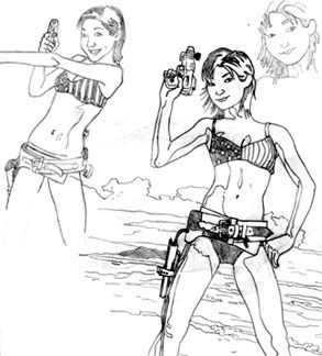
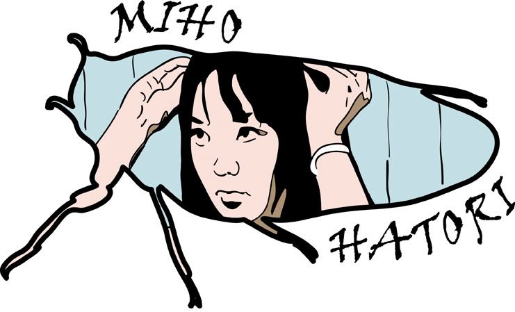
 A digital style I flirted with for a time. It started as a sketchbook page and I "inked" it laboriously, point-to-point in Adobe Illustrator. Then I colored it the same way. It's a competely vector drawing! During the coloring stage I also spent hours adjusting every little line to get a better likeness... looks like a paint-by-numbers kit gone horribly wrong! Wow... I will NEVER do this style again.
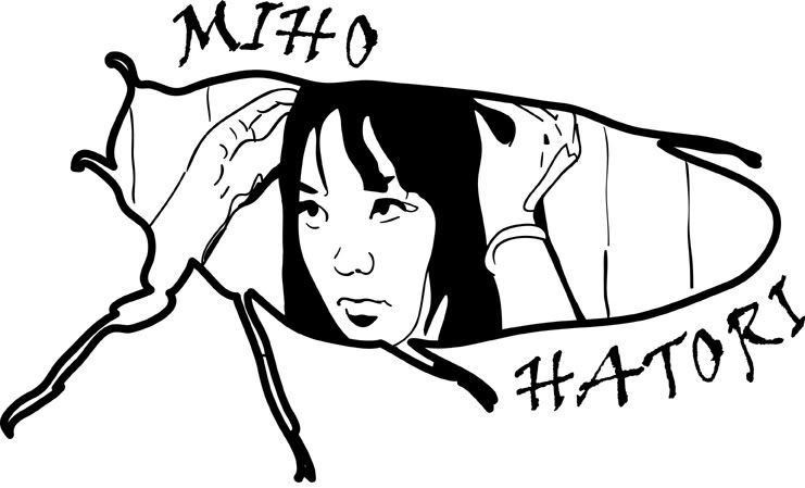